Project Reveal: Chagrin Road
I can’t believe I’m finally able to say this, but here it is – the Chagrin Road house project reveal! After 14 long months, I am proud to show you some pictures of this dream project (for more photographs, you can access the full portfolio here). Built in 1929, this stone “cottage” sits on almost seven acres of property, with a creek running through the front yard. To keep the integrity of this historical home, my design focused on retaining as much of the architectural details as I could, all while using timeless materials in a fresh, modern way. From start to finish, this project was an uphill battle – 92-year old houses will do that to you – but I knew from the first time I walked the home that it could be something truly special.
Kitchen
While the house is fairly sizable, the kitchen was definitely on the smaller size. To compensate for and enhance its tiny proportions, I knew we needed a light and airy space, one that allowed for color continuity throughout. Stainless steel appliances would defeat my goal for consistency, so I selected GE’s café appliances in matte white and coupled them with inset shaker style cabinetry in an eggshell color. We topped off the design with the most beautiful slab of Calacatta Vagli marble for the countertops and white zelligé tile for the backsplash (tiled up to the ceiling). The effect: tonal consistency that provides just enough movement and variation to provide the kitchen some much-needed depth.
Dining Room
What can I say – this room is the stuff of my dreams. While most of the house has wood flooring, I knew I wanted the dining room floor to be special. Like everyone else these days, I fell pretty hard for the checkerboard floor trend, but knew I needed the pattern to be less formal than your traditional black and white pattern. The search for the perfect tile seemed endless, but I finally landed on this gorgeous porcelain marble effect tile we ultimately installed. Replacing black for the greige color in the tile pattern really toned down the formality of the room, resulting in a dining space that can host both casual, family pizza nights and your nice dinner party.
Great Room
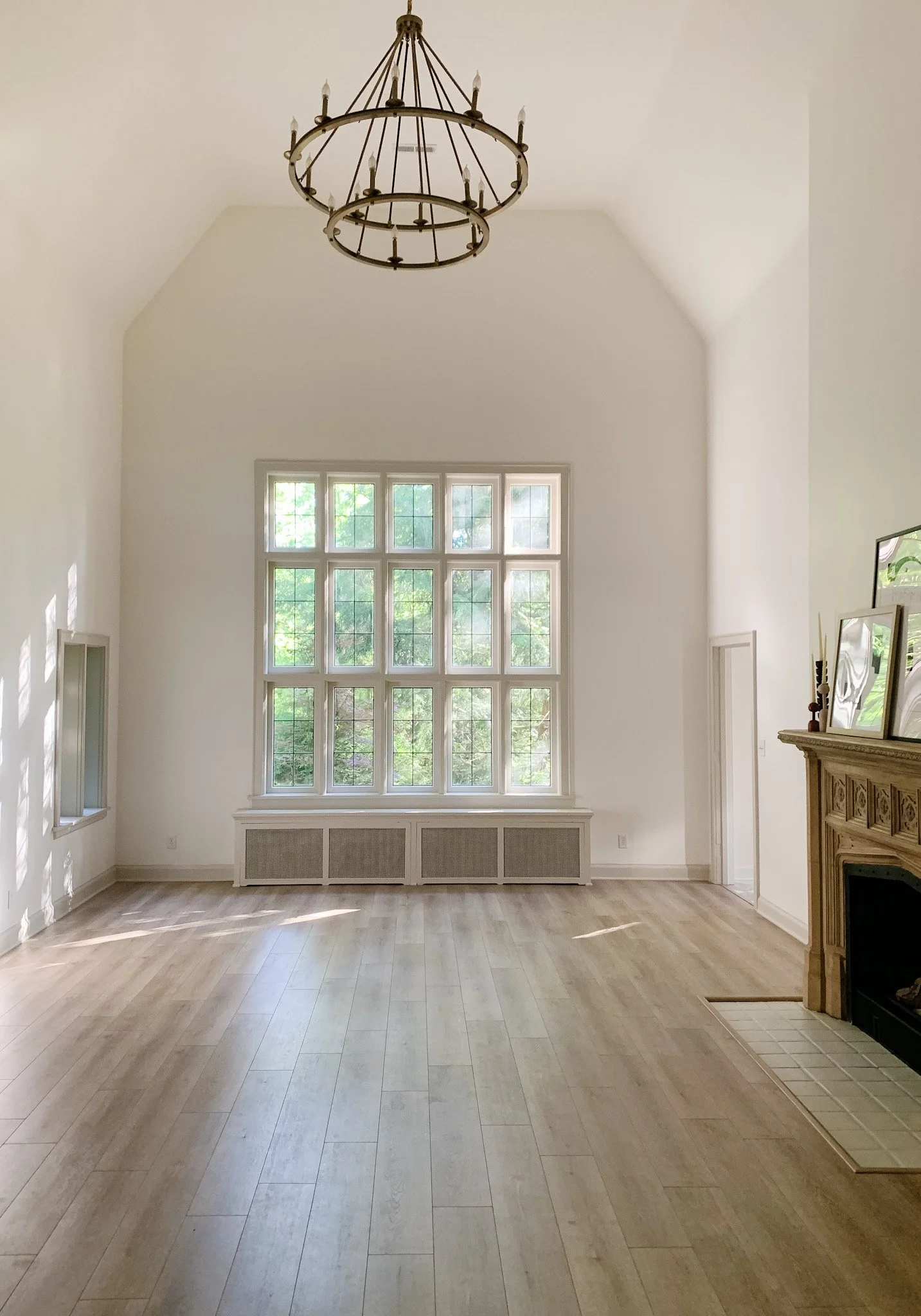
With its soaring ceilings and massive size, the primary living space in this house truly fits its moniker. The previous owner had laid carpet over the original tile flooring, but I envisioned warm, rustic wood flooring to make the room appear cozier than it actually is. Because the original tile was mortared – not merely grouted – into place, we knew we needed a floating floor system. I ended up selecting a quality laminate system, which not only looks good, but also is highly durable. We painted the walls in Simply White by Benjamin Moore (eggshell finish), and chose Edgecomb Gray - also by Benjamin Moore – in a semi-gloss finish to have the trim contrast, yet complement the walls. These updates, while much needed, are really to serve the focal point of the room: the hand-carved travertine fireplace, which is original to the house.
Powder Room
Probably my favorite room in the house, I chose to add subtle color and pattern through the wall treatments. Once a closet, we converted it to a powder room in order to have an additional bathroom on the main floor. Incredibly small – but with a super high ceiling – this little space provides high impact through its wallpaper and vertical shiplap paneling. To honor the house’s history, I chose a beautiful William Morris wallpaper (pattern: Pure Dove and Rose), which has the slightest sheen to it. We installed the vertical shiplap paneling and painted it in Spring Thaw, by Benjamin Moore. Icing on the cake: a hand-blown milk glass pendant to provide all the light you need!
Primary Bath
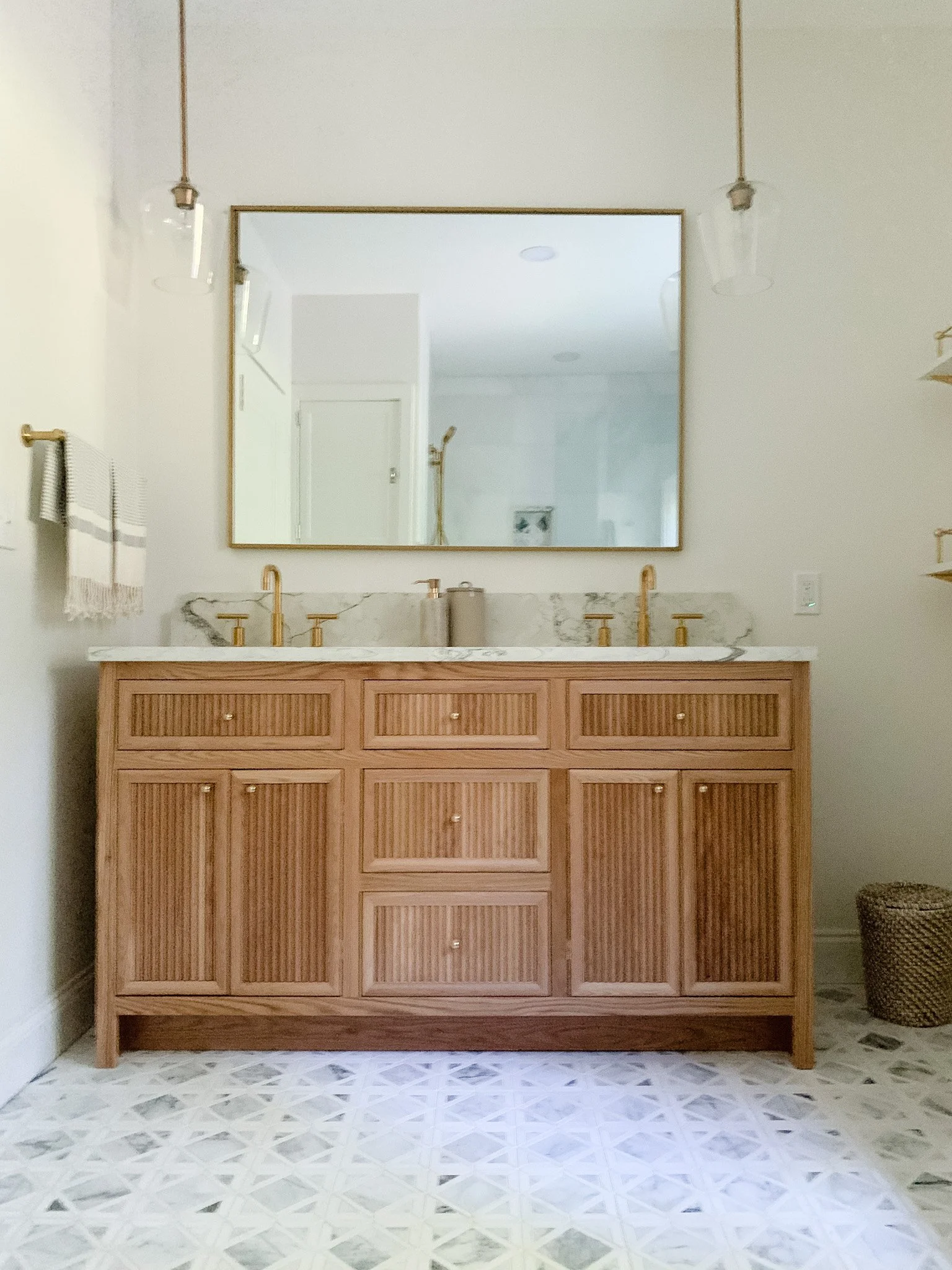
I had the most fun designing the primary bathroom. We expanded this space by taking from the closet (sorry, not sorry!), so that we could provide more storage space through shelving and a larger vanity. Speaking of vanity – be still my heart! – this one is, in my opinion, pretty exceptional. Constructed of white oak, the inset cabinetry is elevated by the reeded detail on the doors and drawers.
For the tile selections, I kept it tonal (again) and chose to mix it up through different tile formats. For the shower stall and surrounding walls, we went with marble field tile in a modern grid pattern. We installed grey marble penny rounds for the shower stall, and chose a marble mosaic in a classic pattern to give some much-needed interest to the space.
I truly enjoyed (and hated - sometimes) this house renovation; it was a real labor of love. I hope you all love the end result as much as I do, and if you’re looking to update or renovate your home, we at MAW Interiors are here to help!


